 By Angelica Bernard
Key Takeaways
- Infographics and data visualization are not just pretty pictures; they are essential tools for effective visual branding, enhancing comprehension and recall of complex information.
- Prioritize clear data storytelling over aesthetic embellishment, ensuring every visual element serves to clarify your brand’s message and insights.
- Implement a consistent visual style guide for all infographics, including brand colors, fonts, and iconography, to reinforce brand identity across diverse platforms.
- Measure the engagement and conversion rates of your visual content, using A/B testing on elements like color schemes and data presentation to continually refine your strategy.
- Invest in professional design tools or expertise, as high-quality infographics significantly outperform amateur efforts in building trust and authority.
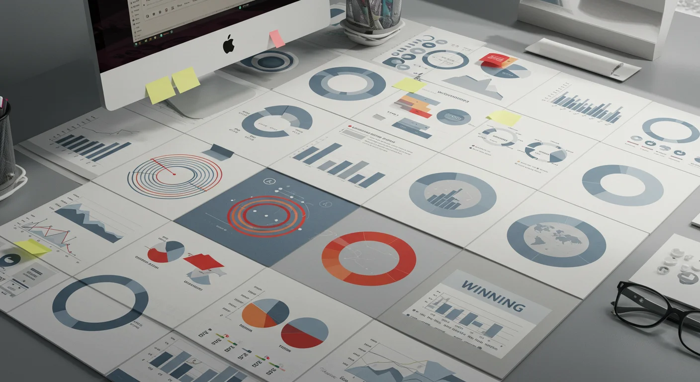
In the crowded digital marketplace of 2026, standing out requires more than just compelling text. It demands a sophisticated approach to visual branding, where infographics and data visualization aren’t mere accessories, but central pillars of your communication strategy. I’ve seen firsthand how a well-crafted infographic can cut through the noise, transforming dry statistics into memorable narratives. How can your brand harness this power to not just inform, but to truly resonate with your audience?
The Power of Visual Storytelling: Beyond Pretty Pictures
Let’s be blunt: if you’re still relying on bulleted lists and dense paragraphs to convey complex ideas, you’re losing your audience. Our brains are wired for visuals. A study by HubSpot Research (according to HubSpot’s marketing statistics) indicated that visual content is 40 times more likely to be shared on social media than other types of content. This isn’t a new phenomenon; it’s an evolutionary preference. When we talk about visual branding with infographics, we’re not just discussing aesthetics; we’re talking about cognitive efficiency. We’re talking about making your message instantly digestible and profoundly impactful.
I recall a client in the B2B SaaS space who struggled to explain their platform’s intricate data integration capabilities. Their whitepapers were exhaustive, but their sales team consistently reported prospects getting lost in the technical jargon. We proposed distilling their most critical feature comparisons and performance metrics into a series of interactive infographics. The transformation was immediate. Conversion rates on their feature pages jumped by 18% within three months. Why? Because we didn’t just present data; we told a story with it. We highlighted the pain points their software solved, visually demonstrating the efficiency gains and cost savings in a way that words alone simply couldn’t.
The core principle here is clarity through visualization. Infographics force you to distill your message down to its absolute essence. You have to identify the most critical data points, understand the relationships between them, and then translate that into a visual language that’s universally understood. This discipline in itself refines your brand’s message, making it sharper and more focused. Don’t think of infographics as a design task; think of them as a strategic exercise in communication.
Designing for Impact: Best Practices for Infographics
Creating effective infographics isn’t about throwing charts and icons onto a canvas. It requires a thoughtful process that prioritizes readability, accuracy, and brand consistency. My team and I follow a strict methodology to ensure every infographic we produce isn’t just visually appealing, but also highly effective.
First, define your objective. What single message do you want the viewer to take away? Is it to demonstrate market growth, explain a complex process, or compare product features? Without a clear objective, your infographic becomes a jumbled mess of data. Once you have that, identify your target audience. A technical audience might appreciate more granular detail and complex charts, while a general consumer audience will need simpler visuals and clearer explanations.
Next, source your data meticulously. GIGO (Garbage In, Garbage Out) applies just as much to visuals as it does to code. Use reputable sources. For instance, if you’re discussing market trends, referencing a recent eMarketer report or Nielsen data lends significant credibility. Always cite your sources clearly within the infographic, even if it’s in smaller print at the bottom. This builds trust and reinforces your brand’s authority.
When it comes to the actual design, simplicity is king. Resist the urge to overload your infographic with too much information or excessive ornamentation. Each element should serve a purpose. I’ve seen countless infographics fail because they tried to cram too much onto one page. Use whitespace effectively to guide the eye. Choose appropriate chart types for your data: a bar chart for comparisons, a line chart for trends over time, a pie chart for proportions (but use them sparingly and for few categories). For creating compelling visuals, I often recommend tools like Piktochart or Venngage for teams without dedicated design resources, though for truly custom and impactful visuals, professional design software like Adobe Illustrator is indispensable.
Finally, and this is where many brands stumble, ensure brand consistency. Your infographic should immediately be recognizable as yours. This means using your brand’s color palette, typography, and iconography. If your brand uses a specific illustration style, incorporate that. This isn’t just about looking good; it’s about reinforcing your executive brand identity every single time someone interacts with your content. A fragmented visual identity dilutes your brand’s impact and makes it harder for your audience to connect with you.
Data Visualization as a Strategic Asset for Brand Building
Infographics are more than just a marketing tactic; they are a strategic asset for building and solidifying your brand’s reputation. Think about it: when you consistently present complex information in a clear, engaging, and authoritative manner, what does that communicate about your brand? It says you are knowledgeable, transparent, and user-centric. This is the essence of strong visual branding.
We recently worked with a financial services firm that wanted to educate potential clients on the intricacies of retirement planning. Their existing materials were dense and intimidating. Our approach was to break down each stage of retirement planning into a series of interconnected infographics. We used a consistent color scheme, a friendly yet authoritative tone, and simplified financial jargon into easily understandable visual metaphors. For instance, we used a “journey” metaphor with milestones and progress bars to illustrate different savings stages. The result? Not only did their website engagement metrics improve significantly, but their sales team reported that clients came into meetings feeling more informed and less overwhelmed, leading to more productive conversations and higher close rates. This wasn’t just about explaining; it was about empowering their audience, which in turn built immense trust in the brand.
Another crucial aspect is using data visualization to demonstrate thought leadership. By analyzing industry trends, conducting proprietary research, and presenting those findings in compelling visual formats, you position your brand as an expert. This is particularly effective in B2B environments. Imagine a software company publishing an infographic on the “Top 5 Cybersecurity Threats for 2026,” backed by their own research and presented with clear, actionable insights. That piece of content becomes a valuable resource, shared widely, and directly attributes expertise to that company. This kind of content marketing, driven by strong visual data, establishes credibility that plain text simply cannot match. It’s a long game, but the dividends in personal brand ROI are substantial.
Measuring Success and Iterating for Improvement
Creating beautiful infographics is only half the battle. The other half, and arguably the more important one, is understanding their impact. Without proper measurement, you’re just guessing. I insist on a rigorous analytical approach to all visual content.
Key metrics I always track include engagement rates (how long are people viewing the infographic, are they scrolling through the entire thing?), share rates across social platforms, and crucially, conversion rates. Are people downloading the associated whitepaper? Are they signing up for a demo after viewing the infographic? If the infographic is embedded on a landing page, what’s the bounce rate compared to pages without strong visual content? We use tools like Google Analytics to track page views, time on page, and conversion funnels, often setting up specific event tracking for interactive elements within the infographics themselves.
I had a fascinating case last year where an infographic we designed for an e-commerce brand was performing well in terms of shares, but its click-through rate to the product page was surprisingly low. Upon deeper analysis, using heat mapping tools, we discovered that while people loved the overall design, the call-to-action button was visually weak and placed too far down the page. A simple A/B test with a bolder button and a more prominent placement resulted in a 40% increase in click-throughs. This illustrates a critical point: iteration is essential. Don’t just set it and forget it. Test different color schemes, different data representations, even different headlines. Small tweaks can yield significant results.
Furthermore, consider how your infographics perform across different channels. What works on LinkedIn might not translate directly to an email newsletter. A static image might be perfect for a blog post, but a short animated data visualization could be more effective on a platform like Instagram. Understanding these nuances and adapting your visual branding strategy accordingly is what separates good marketers from great ones. Always be asking: “How can this be better?” and “What does the data tell me about its performance?”
Visual content, particularly well-executed infographics and data visualizations, is no longer a luxury; it’s a necessity for effective visual branding. By focusing on clarity, consistency, and continuous improvement, your brand can harness the immense power of visuals to tell compelling stories, build authority, and drive tangible business results in 2026 and beyond.
What makes an infographic effective for visual branding?
An effective infographic for visual branding is clear, concise, visually appealing, and consistent with the brand’s overall identity. It distills complex data into easily digestible visuals, uses brand colors and fonts, cites credible sources, and has a single, well-defined message that resonates with the target audience.
How important is data accuracy in infographics?
Data accuracy is paramount. Inaccurate data undermines your brand’s credibility and can lead to distrust. Always source your data from reputable organizations like Nielsen, eMarketer, or academic studies, and clearly cite these sources within the infographic to build audience trust.
Should all infographics use the same visual style?
Yes, maintaining a consistent visual style across all your infographics is crucial for strong visual branding. This includes adhering to your brand’s color palette, typography, iconography, and overall design aesthetic. Consistency reinforces brand recognition and builds a cohesive brand image over time.
What tools are recommended for creating professional infographics?
For professional-grade infographics, I recommend design software like Adobe Illustrator for full customization. For teams needing more accessible options, platforms like Piktochart or Venngage offer user-friendly interfaces and templates that can produce high-quality results when guided by strong design principles.
How can I measure the success of my infographic campaigns?
Measure success by tracking engagement metrics (views, time on page), social shares, and conversion rates (downloads, sign-ups, click-throughs to product pages). Use analytics tools like Google Analytics and conduct A/B testing on different visual elements to identify what resonates most effectively with your audience and iterate for continuous improvement.


